Matt Mullenweg, lead developer of WordPress, recently announced plans for “a set of interface guidelines similar to Apple’s or Yahoo’s detailing what was found in the research, so core WP devs, plugin authors, and other web devs can make better decisions about interactions in the future.” (The research he’s referring to—commissioned by Automattic—was done by the Happy Cog web design team, the folks behind A List Apart, in case you didn’t know.)
His comments came in response to criticism on Khaled Abou Alfa’s Broken Kode blog of the still inchoate WordPress admin theme redesign.
Apple’s “human interface guidelines” are highly regarded, so WordPress would certainly benefit from anything similar. Some of the material for the WordPress guide will probably come from the same research showcased in a talk about usability Happy Cog member Liz Danzico gave at WordCamp 2007. Unfortunately, I wasn’t able to attend WordCamp, but various blog notes and slides from her talk give me the gist, and the Happy Cog-inspired changes appearing in development WordPress provide further clues. Here are some points I expect to see:
- Make things easy to find. Apparently this means a navigational structure in which one uses verbs to find nouns. Here’s an example:

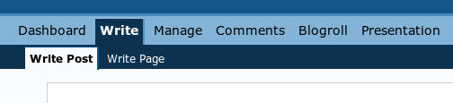
The first image is from the new admin rework, still in progress. The second is the current design. Notice how in the first, newer, design, there is more of an emphasis on verbs in the top-level menu: “Design” has replaced “Presentation,” and though not visible in the screenshot, “Settings” has replaced “Options.” In the sub-menu, however, there is an emphasis on the objects being managed: instead of “Write Post” the new design just has “Post.” - Be consistent. Users don’t like surprises, Danzico said. For WordPress, being consistent will probably mean similar ways of handling objects. For example, the lists of published posts, comments, and users should be arranged similarly, say by editing, viewing, and deleting them from similar-looking controls.
- Unconscious design. Good design doesn’t get in the way of users; it’s transparent in the sense that users don’t notice it, they just do what they need to do.
Those are mostly Danzico’s ideas, as much as I can glean second-hand. If someone were to ask my opinion on what WordPress should do to improve usability (and no one will), here’s what I would suggest:
- Dump the “Dashboard.” I’ve never met someone who actually paid attention to most of the stuff on the Dashboard except for the incoming links. It does appear from Danzico’s slides that there might be a Dashboard overhaul in the works, so perhaps it will soon become more useful.
- Improve attachment—i.e. image—uploading. Currently image uploading has a couple of serious drawbacks. First, there’s no control of size: you get either the thumbnail or original image. The problem is that many people just want to upload straight from their cameras, and the original image is too large practically-speaking for the web. Second, attachments must be made one at a time, which can be tedious if you have a number of photos. Unfortunately, there’s probably no way to get around the second problem without using a proprietary technology such as Flash or Java.
- Fix search. This isn’t an admin issue as much as an overall WordPress problem: you can rarely find what you’re looking for using the WordPress search box. According to usability expert Jakob Nielsen, bad site search is the number-one mistake in web design. Although that may be the most common mistake it’s not the most serious, in my opinion. I think most people get around it by just using Google to search a particular site. However, better search capability would give WordPress greater credibility as a CMS.
Mullenweg said we could expect that user interface guide in February, so I’m looking forward to seeing it, and I’ll be sure to discuss it here as soon as it’s available.
One Comment
I have to agree with you about improving attachment uploading. I’ve taught many beginners how to use WordPress and that is probably the hardest thing for them to grasp.
I almost always install the Flexible Upload plugin from http://blog.japonophile.com/flexible-upload/ because you can set a maximum size and thumbnail size. It helps a lot but there’s still room for improvement. For example, I’d love to see thumbnail sizes specified in the theme. They could then be generated on the fly to the correct size the first time then cached.